Friday
May072010
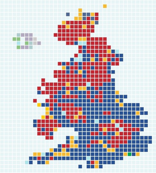
: u.k. election results viz
 Friday, May 7, 2010 at 04:11AM
I can't even pretend to know too much about British politics and the recent election. I do however love this interactive visualization done by the Guardian to help communicate yesterday's results. I see more and more news outlets such as the Guardian, NYTimes and even NPR putting great effort into telling stories visually. This is an important key to keeping us informed, and educated. The amount of data coming at us today is astounding. Designers need to learn how to communicate this in easier to digest ways. See viz here or click image below.


in  Blog
Blog
 Blog
Blog 
Reader Comments