Friday
Jul302010
: aflac
 Friday, July 30, 2010 at 06:27AM
We as designers/creatives often complain about doing work that might on the surface seem boring or conservative. Here is a great example of turning that notion on its head. I guess it helps to have a duck as your spokesperson, but even then, Firstborn could have gone the safe route with the site design. The fun lighthearted design really does delight and surprise. This in turn creates a very strong emotional connection with the customer. Job done.


Friday
Jul302010
: otl aicher
 Friday, July 30, 2010 at 04:46AM
Time for some good old-fashioned German graphic design. I keep running into Otl Aicher, and not even knowing it. I posted about his 1972 Munich Olympics posters before, but here is some more of his work you will probably recognize immediately, or feel that certain familiar comfort you get from work that is so far reaching and influential. This includes the great typeface Rotis.


Wednesday
Jul282010
: future banking
 Wednesday, July 28, 2010 at 11:09AM
Thanks to Adam Bracegirdle at Sid Lee for pointing me to this.
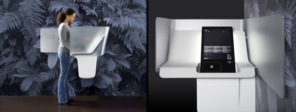
Check out the fantastic video here at this link of IDEO's work at designing the next generation of ATMs. As is typical for them, they start by asking how to make the technology more human. This, as usual leads to some amazing insights. Then they layer on the elements that will "delight and surprise" the user, to create strong personal and "emotional connections" between banks (brands) and users. Right on.


Check out the fantastic video here at this link of IDEO's work at designing the next generation of ATMs. As is typical for them, they start by asking how to make the technology more human. This, as usual leads to some amazing insights. Then they layer on the elements that will "delight and surprise" the user, to create strong personal and "emotional connections" between banks (brands) and users. Right on.


Tuesday
Jul272010
: but does it float?
 Tuesday, July 27, 2010 at 07:19AM
This is a great collaborative, curated blog of imagery. The two responsible are Folker Gorter (see design work at link) and Atley Gasky a designer at GOOD. I especially love the little nuggets/themes for the individual posts. Thought provoking and inspiring - like this one for instance "Compositions of speeds and slownesses on a plane of immanence"
 Painting by Peter Zimmerman
 Painting by Peter Zimmerman
Monday
Jul262010
Friday
Jul232010
: field
 Friday, July 23, 2010 at 03:31AM
I am drawn to this kind of interactive and generative work that Field does. They work out of London for brands such as Red Bull (see video below), Nike, Nokia, and XBox. They are led by Marcus Wendt, and Vera-Maria Glahn, who draw inspiration from art, nature, science, and other generative processes such as concepts around artificial life. Go visit their site for a view into how this work translates into animation, print, websites, and interactive installations.
"New kinds of imagery can be found on unknown pathways. Generative processes, interactivity, and science and technology provide a wide field of inspiration and new ways of thinking that foster unusual strategies and powerful concepts for visual design. FIELD uses code to expand the graphical toolbox, and designs custom software to express an idea cross-media."


Red Bull 3D Soundclash from FIELD on Vimeo.
"New kinds of imagery can be found on unknown pathways. Generative processes, interactivity, and science and technology provide a wide field of inspiration and new ways of thinking that foster unusual strategies and powerful concepts for visual design. FIELD uses code to expand the graphical toolbox, and designs custom software to express an idea cross-media."


Red Bull 3D Soundclash from FIELD on Vimeo.
Thursday
Jul222010
Wednesday
Jul212010
: world cup typography
 Wednesday, July 21, 2010 at 03:41PM
Interesting interview/article on the typeface Unity. It was developed in Amsterdam at the agency 180 as a unifying visual element to coincide with all of the adidas 2010 Fifa World Cup assets. The Brazilian designer, Yomar Agusto working out of Rotterdam worked with the adidas product developers to base the typeface on the fundamental "round triangular" shape found in the official match ball, the Jabulani.
“Adidas had a vision that every element of their football identity was to be linked and unified by one basic shape. This shape can be found as a design element on the official match ball of the World Cup, so the first drawings came from the product designers at Adidas. We at 180 had the task to bring it to life and inject its personality into the whole alphabet. Says Yomar Agusto


“Adidas had a vision that every element of their football identity was to be linked and unified by one basic shape. This shape can be found as a design element on the official match ball of the World Cup, so the first drawings came from the product designers at Adidas. We at 180 had the task to bring it to life and inject its personality into the whole alphabet. Says Yomar Agusto


